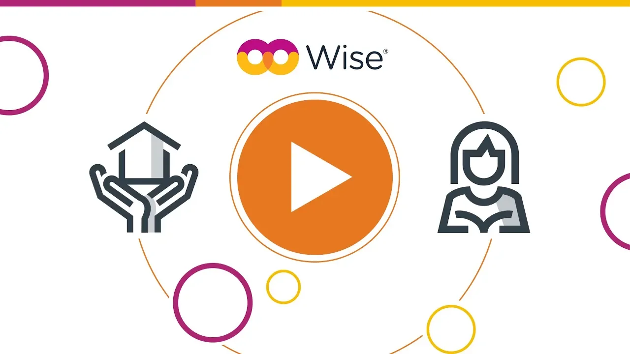


The existing Wise identity relied on photography. For a platform built around community inclusion, the visual language was telling the wrong story.
The rebrand replaced photography with illustration as the core system. A flexible illustration-based language can represent a wide range of people, programs, and contexts without depending on a camera to do it. Built largely solo across three products, the system scaled to 60+ assets spanning web, social media, conference booths, and Dutch market materials. A motion designer extended it into animation. It's now the most consistent and versatile brand in the OCLC portfolio.


Wise didn't come as a rebrand project. The brief didn't exist until the problem became clear enough to name.
To rebuild the Wise visual identity around a scalable illustration system that could represent its audience accurately, hold visual cohesion across every touchpoint, and give the brand a distinct voice within the OCLC product suite.
Next projects.
(2008-26©)