
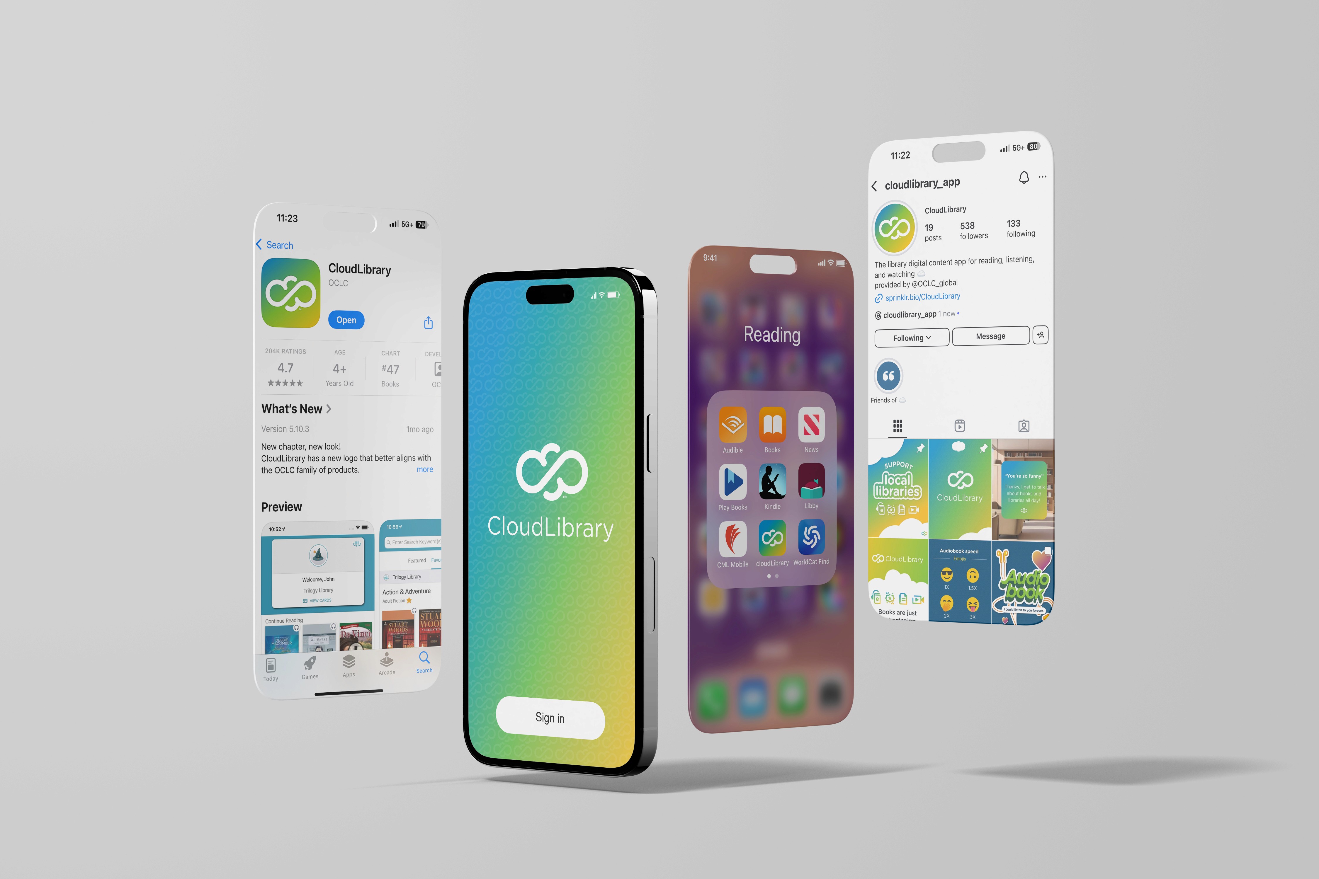
Before the acquisition, CloudLibrary had an outdated visual identity. It was a capable product that looked like it wasn't. The task was to close that gap.
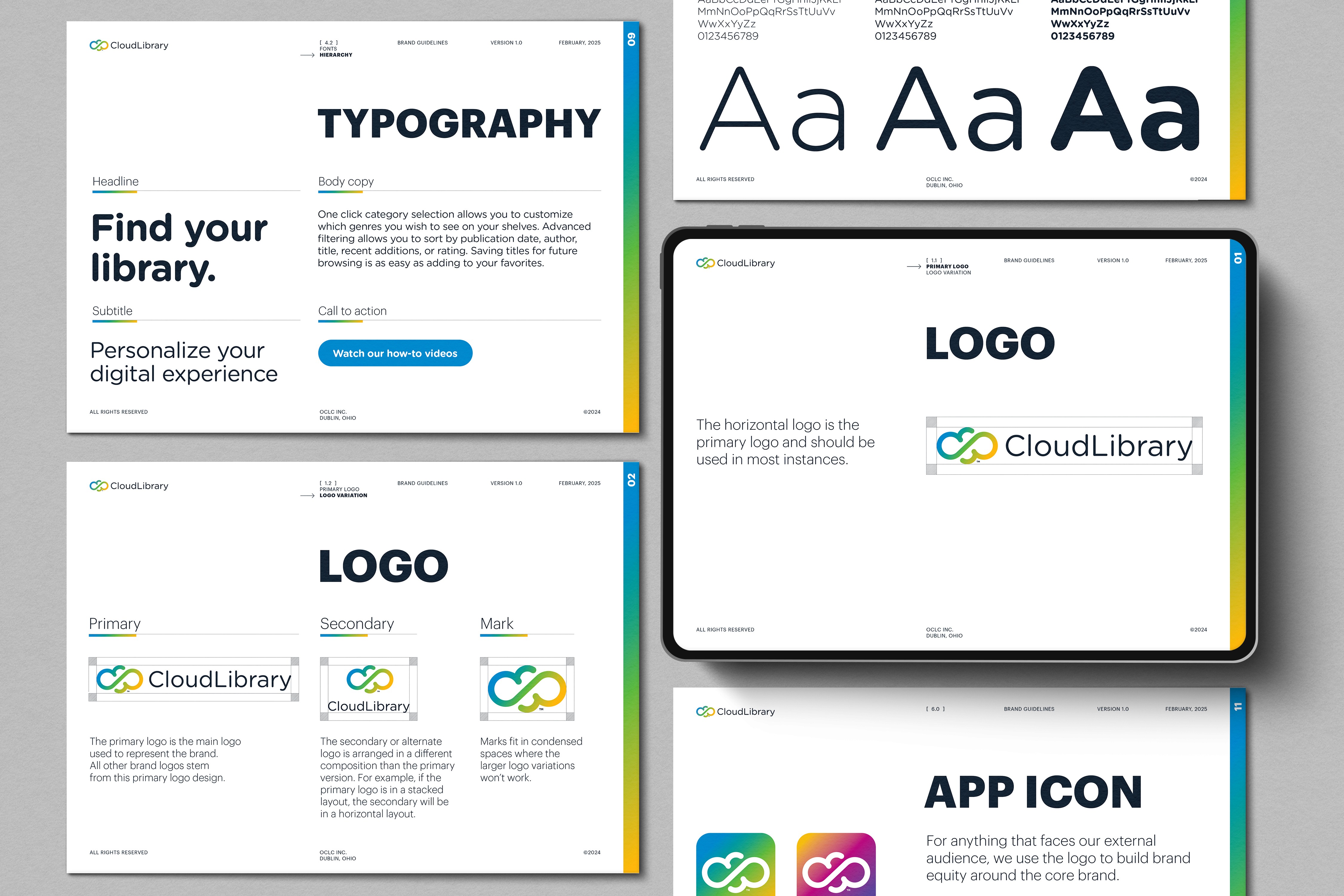
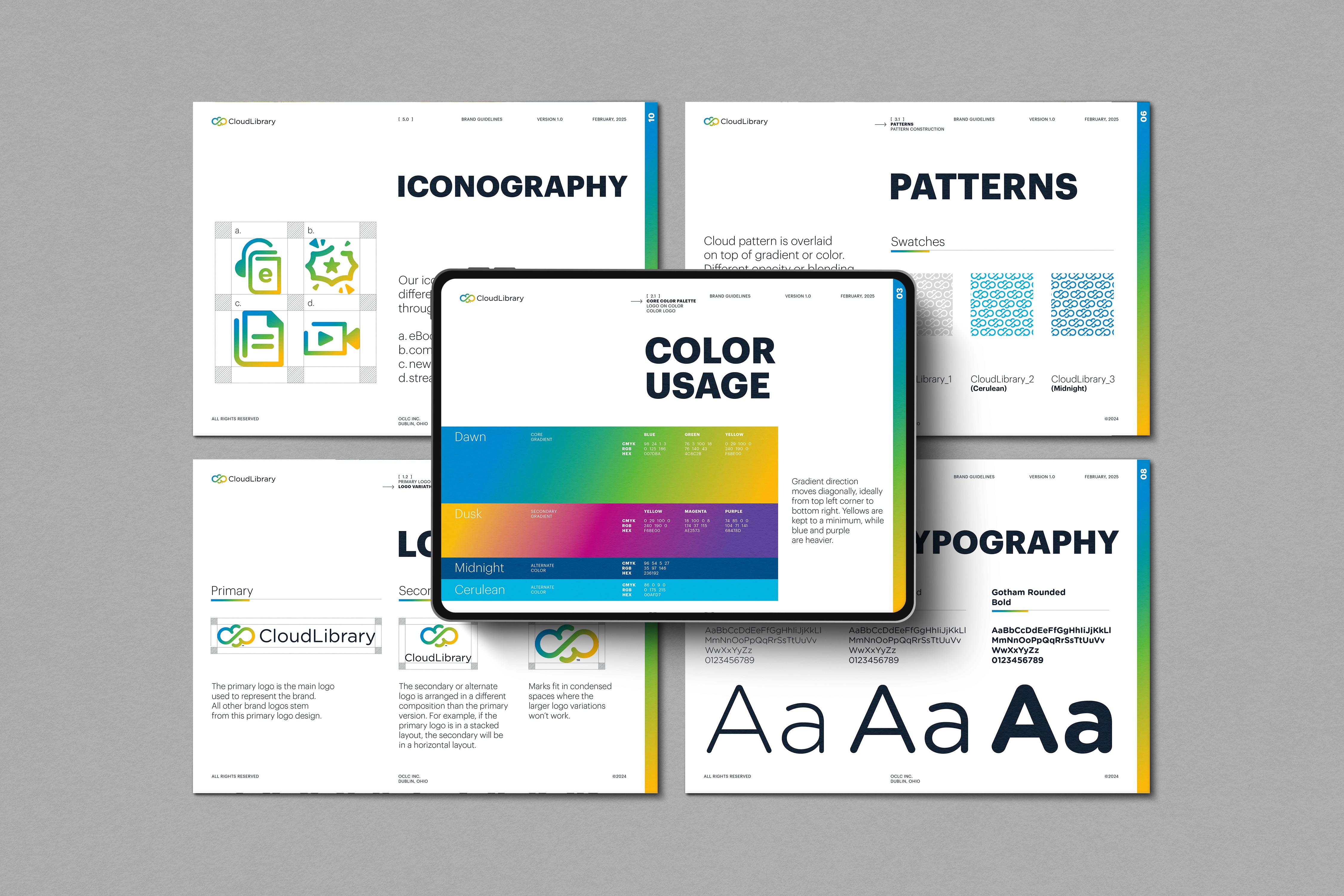
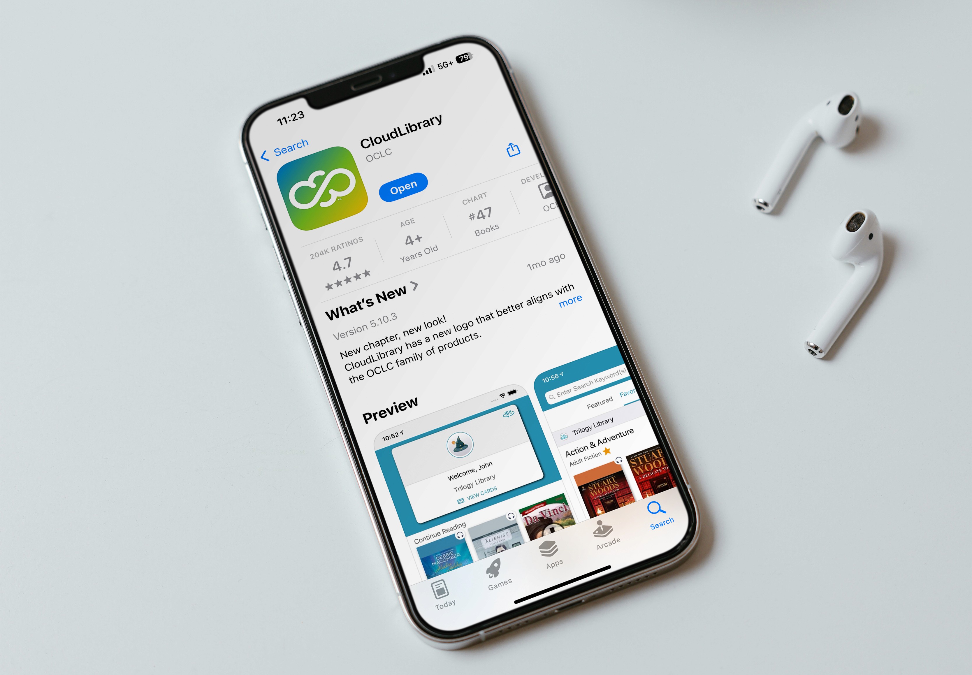
The redesign built the brand from scratch: logo variations, color system, iconography, patterns, and guidelines. A blue, green, and yellow gradient drawn from the existing OCLC palette gave the brand a distinct, welcoming feel without breaking suite consistency. Rounded corners in the typeface and iconography reinforced a softer, consumer-friendly tone. The abstract cloud shape introduced a flexible canvas element that moved away from the corporate grid without abandoning brand structure. A full sales toolkit followed: posters, web banners, postcards, and a landing page deployed in English, French, and Spanish across North America, Australia, and New Zealand. The brand now drives, as of writing, 918K+ annual site visits, 6,000+ toolkit downloads, and 100+ quote form submissions.
A library app serving the general public needs to feel different from the enterprise products around it. That's not a visual preference. It's a positioning requirement.
To build a brand identity for CloudLibrary that could stand on its own as a consumer-facing product, integrate cleanly within the OCLC suite, and give the sales team a toolkit they could deploy independently across three language markets.
Next projects.
(2008-26©)